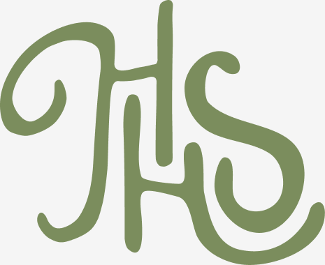
A hand-drawn, heritage-inspired logo suite and brand identity for a Hockley Valley candle and home goods brand
A founder-led home goods brand from the Hockley Valley, starting with hand-poured vintage candles.
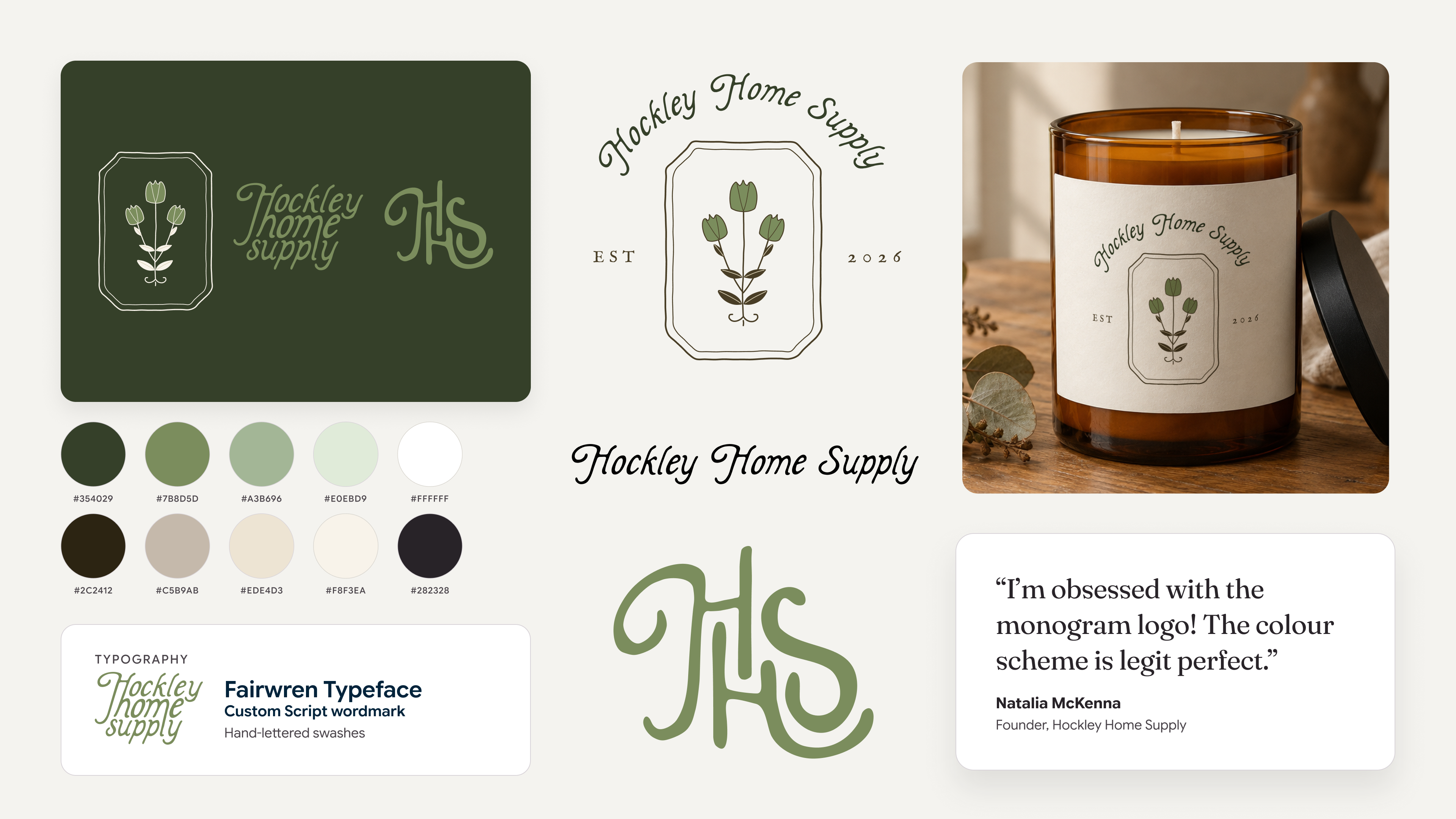
Hockley Home Supply is a founder-led home goods brand, starting with hand-poured vintage candles.
The name Hockley Home Supply comes from the founder's love of her historic town. The Hockley Valley is known for its close-knit community, rolling farmland, and quaint downtown.
She wanted a name with room to grow past candles into a wider home line. She came in with a clear vision: a mood board, a collection of fonts she'd saved over time, and a love for warm, heritage-feeling design.
The founder had plenty of inspiration but no single mark that tied it together. She needed a logo system that felt cozy and timeless, worked on small packaging like candle bags and totes, and could carry the brand past its first product into a full decor line.
We started from the founder's own inspiration and pushed it one step further. She wanted cozy, timeless colors like chocolate browns, forest greens, and taupes. The first draft used that palette with a font a little funkier than her references, which gave her a clear point to react to. Quick feedback rounds shaped the final direction from there.
- Her references first: Every round started from the founder's mood board and saved fonts.
- Fast feedback: Six versions, each one narrowing the direction until the suite was final.
- Built for small packaging: Every mark was designed to read on candle bags, totes, and social.
Logo design
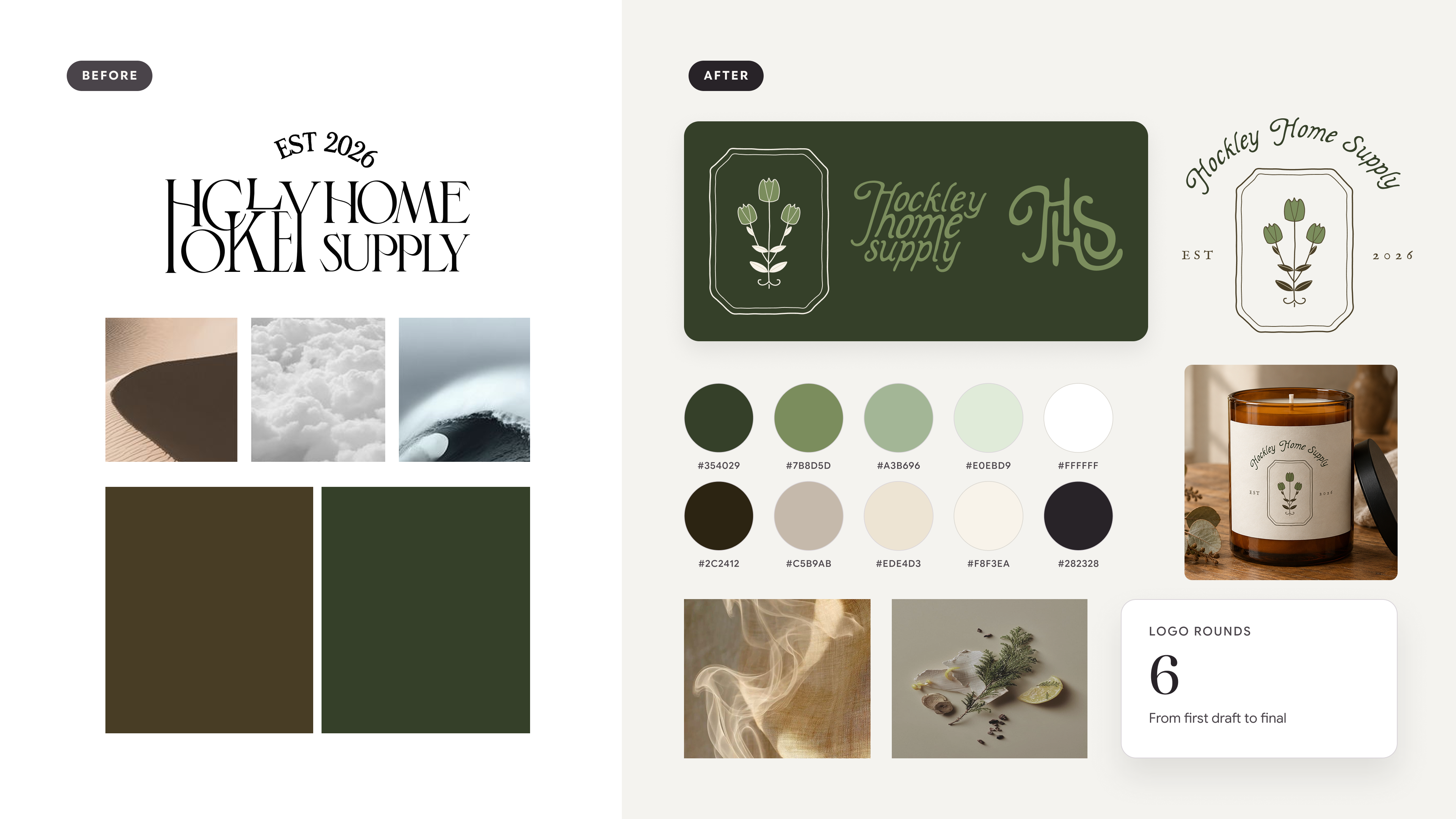
01 · Discovery
Reviewed the founder's mood board, font collection, and naming history to define the feel: warm, heritage, and a little whimsical.
Deliverables
- Mood board
- Creative direction
- Color palette
- Typeface review
- Logo mockups
02 · Concepts
Delivered a first draft that stretched the brief, then refined it with two variations focused on the legibility of "Hockley."
Deliverables
- 3 logo concepts
- Wordmark and monogram options
- Legibility refinements
03 · Refinement
Pushed a fourth round for range, then finalized the monogram with the elongated, swashed H the founder loved. She wasn't sold on the font yet, so we locked the design direction before choosing the final logo.
Deliverables
- Final HS monogram
- Emblem and wordmark direction
- Product mockups
Emblem, wordmark, and color
01 · Type pairing
The founder asked for a more whimsical touch, so we explored pairing her favorite script, Fairwren, with a serif to balance charm and readability.
Deliverables
- Script and serif pairing options
- Final script wordmark
02 · Emblem
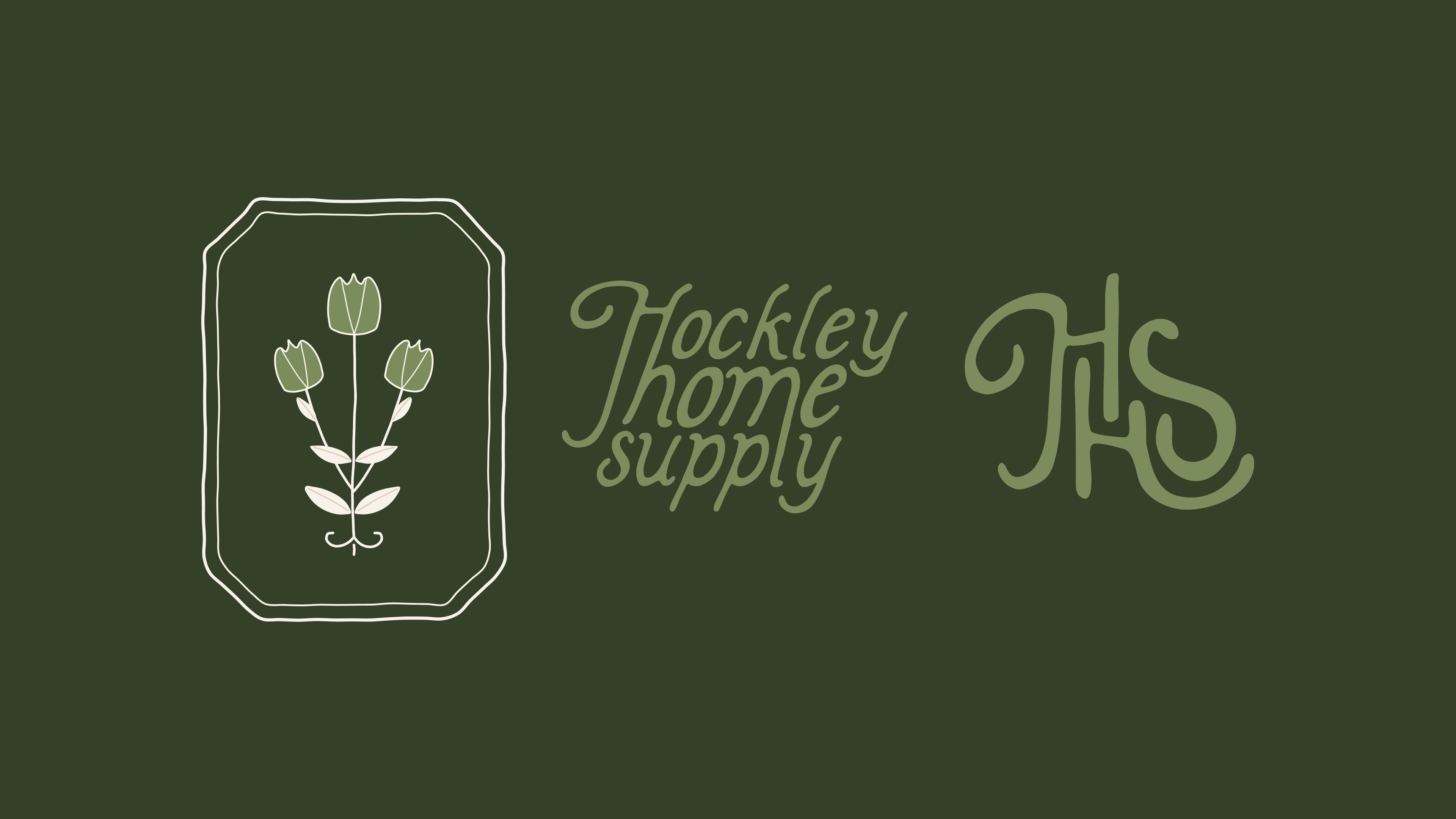
Drew a hand-drawn emblem: a three-bloom floral sprig inside a clipped-corner bookplate frame with a double keyline. The slightly imperfect line keeps it feeling made by hand, like the candles.
Deliverables
- Bookplate emblem
- Script wordmark
- HS monogram
03 · Colorways
Finalized the suite in a 10-color palette of forest greens, warm neutrals, and deep browns, ready for packaging, totes, and social.
Deliverables
- 10 colors: Evergreen, Olive, Leaf, Caterpillar, White, Chocolate, Sand, Icing, Pearl, Ink
- Logo files in each colorway
Packaging and launch assets
01 · Candle label
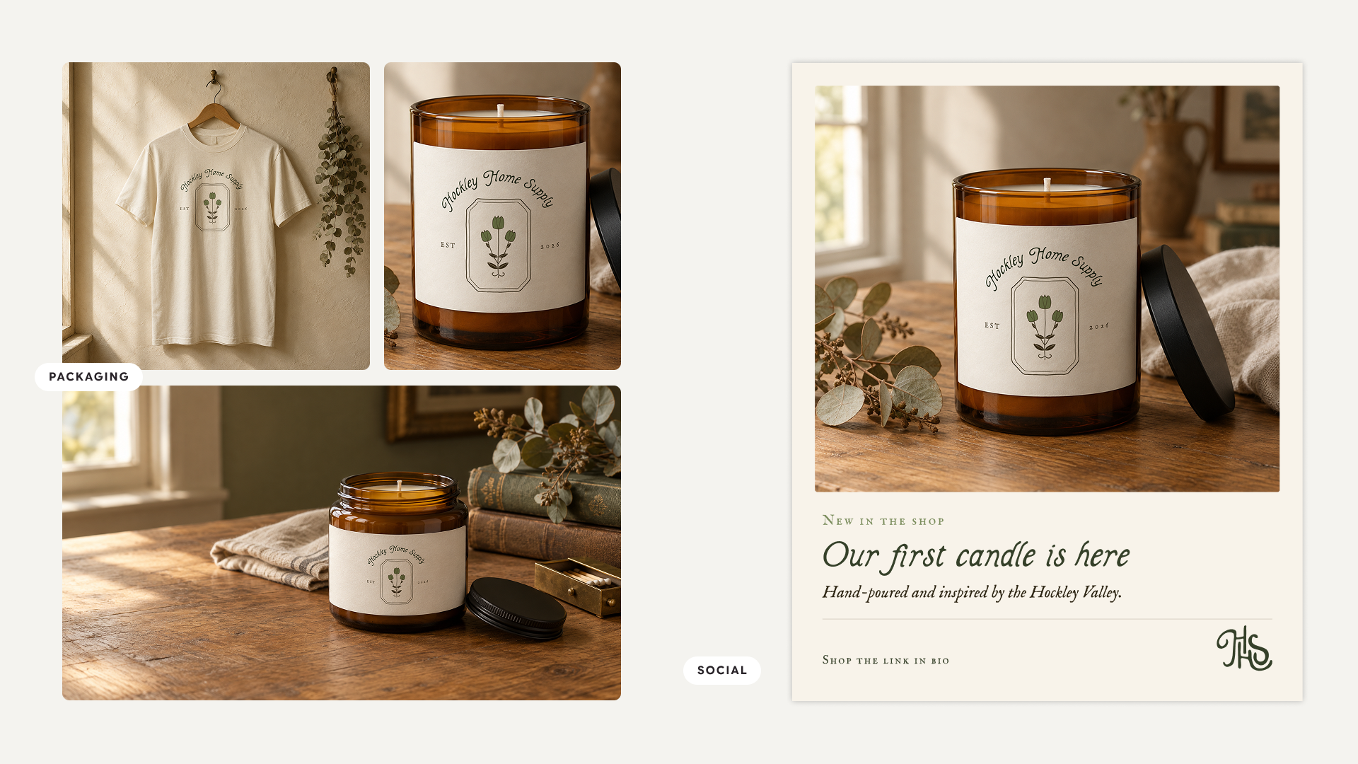
Designed the candle label around the emblem, with the script wordmark arched above it and an Est. 2026 date line, sized to wrap an amber apothecary jar.
Deliverables
- Candle label artwork
- Arched wordmark lockup
- Est. 2026 date line
02 · Product mockups
Placed the label on amber candle jars and the emblem on a natural cream tee, so the founder could see the brand on real products before anything went to print.
Deliverables
- Candle jar mockups, square and 16:9
- Apothecary jar mockup
- T-shirt mockup
03 · Social templates
Built three Instagram post templates in the brand fonts and colors, ready for launch posts, brand moments, and merch drops.
Deliverables
- Product launch template
- Brand moment template
- Merch drop template
What changed

Hockley Home Supply now has a cozy, timeless brand system ready for its first candles and the home line that follows.
- A final logo suite: hand-drawn emblem, script wordmark, and HS monogram
- A 10-color palette of greens, warm neutrals, and browns
- A candle label and product mockups ready for print
- 3 Instagram templates ready for launch
- A name and mark built to grow beyond candles
"I'm obsessed with the monogram logo! The colour scheme is legit perfect. I am excited to put this on totes and little candle bags."
Explore other projects


Ready to look like where you are heading?
Fixed-scope brand, website, and marketing sprints for founder-led companies. No retainers or hourly billing.
Brand, web, and marketing for founder-led startups, run by a senior brand lead who's built it in-house.
hello@hialoola.com