
Rebranding Soutron and redesigning its website around one clear story for five audiences
Cloud-based library, archive, and knowledge management software with 30+ years in the field.
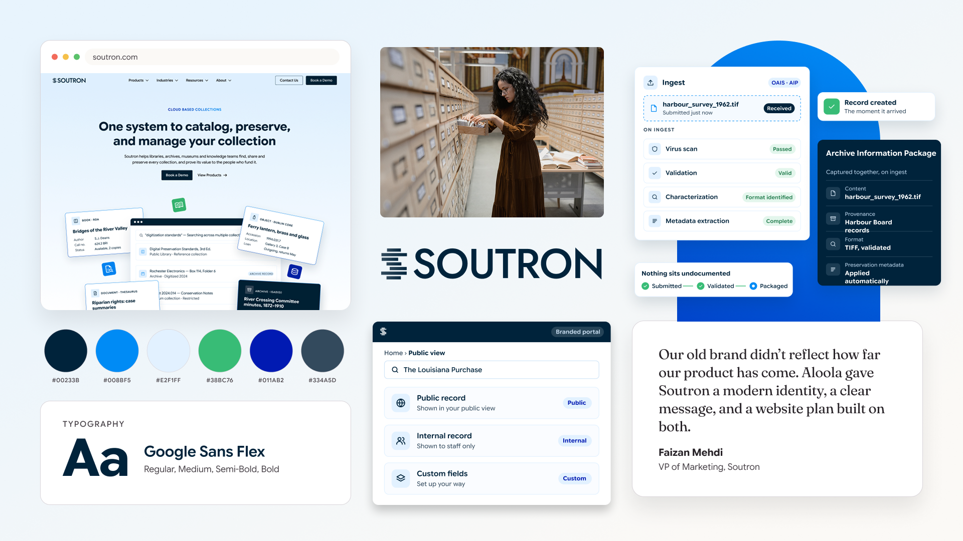
Soutron helps libraries, archives, museums, and legal teams manage and share their collections in the cloud.
Soutron has built library and knowledge management software for more than 30 years. Its customers range from public libraries and corporate knowledge centers to law firms, archives, and museums.
Soutron came to Aloola for a website redesign. To make the new site work, it also needed to:
- Define one clear position across five very different audiences
- Replace a logo and palette that felt rooted in the late 90s
- Clean up a sprawling site full of duplicate and outdated pages
- Give every product and audience a clear path on the new site
Soutron's product had kept up with the times, but its brand and website hadn't. The old blue and orange palette and swoosh logo read as dated, and the site had grown into a maze of regional mirrors, old landing pages, and overlapping product pages. Each audience needed a different message, and nothing tied them together.
We recommended locking positioning before any web design, so the site would be built on a stable story instead of being rebuilt twice. From there, every phase built on the one before it.
- Positioning first: Defined the core message and five audience personas before designing a single page.
- Audit before design: Mapped every page on the old site to decide what to keep, merge, or remove.
- One brand system: Built a logo, palette, and type system that works across products and audiences.
- Feedback through one contact: Consolidated client feedback through a single point of contact, with each phase signed off before the next began.
Positioning and messaging
01 · Audience personas
Built in-depth personas for Soutron's five audiences, separating the researchers who use the product from the decision makers who buy it.
Deliverables
- Personas for public libraries, archives, legal teams, museums, and corporate libraries
- Researcher and decision maker profiles
- Pain points and value props by persona
02 · Positioning
Defined the problem Soutron solves, where competitors fall short, and the one story that ties every product and audience together.
Deliverables
- Marketplace problem and competitive gaps
- Positioning statement
- Tagline and key pillars
03 · Messaging
Turned the positioning into plain-language messages, with no jargon, that the website and marketing teams could use right away.
Deliverables
- Long and short company overviews
- Key messages by persona
- Proof points by audience
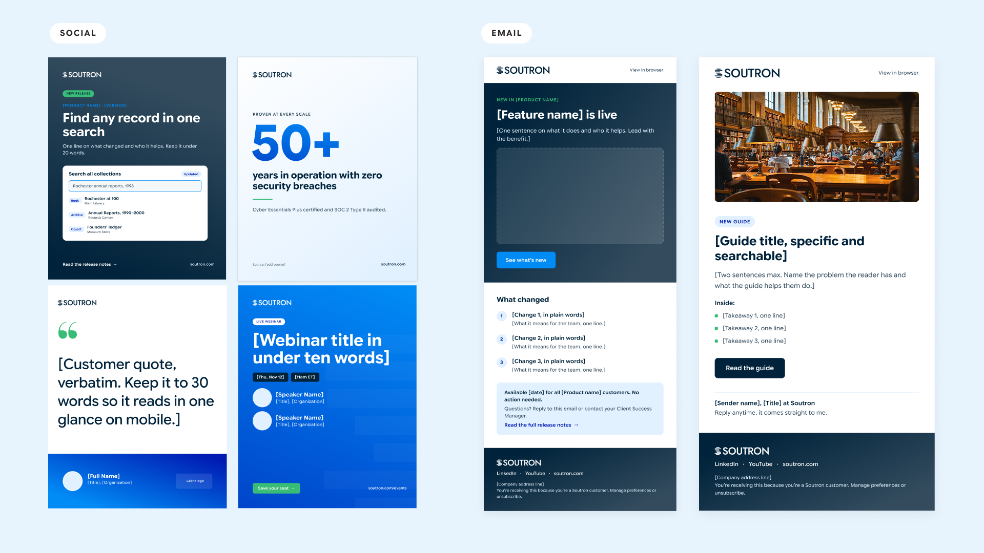
- Social media templates
- Email templates
Brand identity
01 · Logo
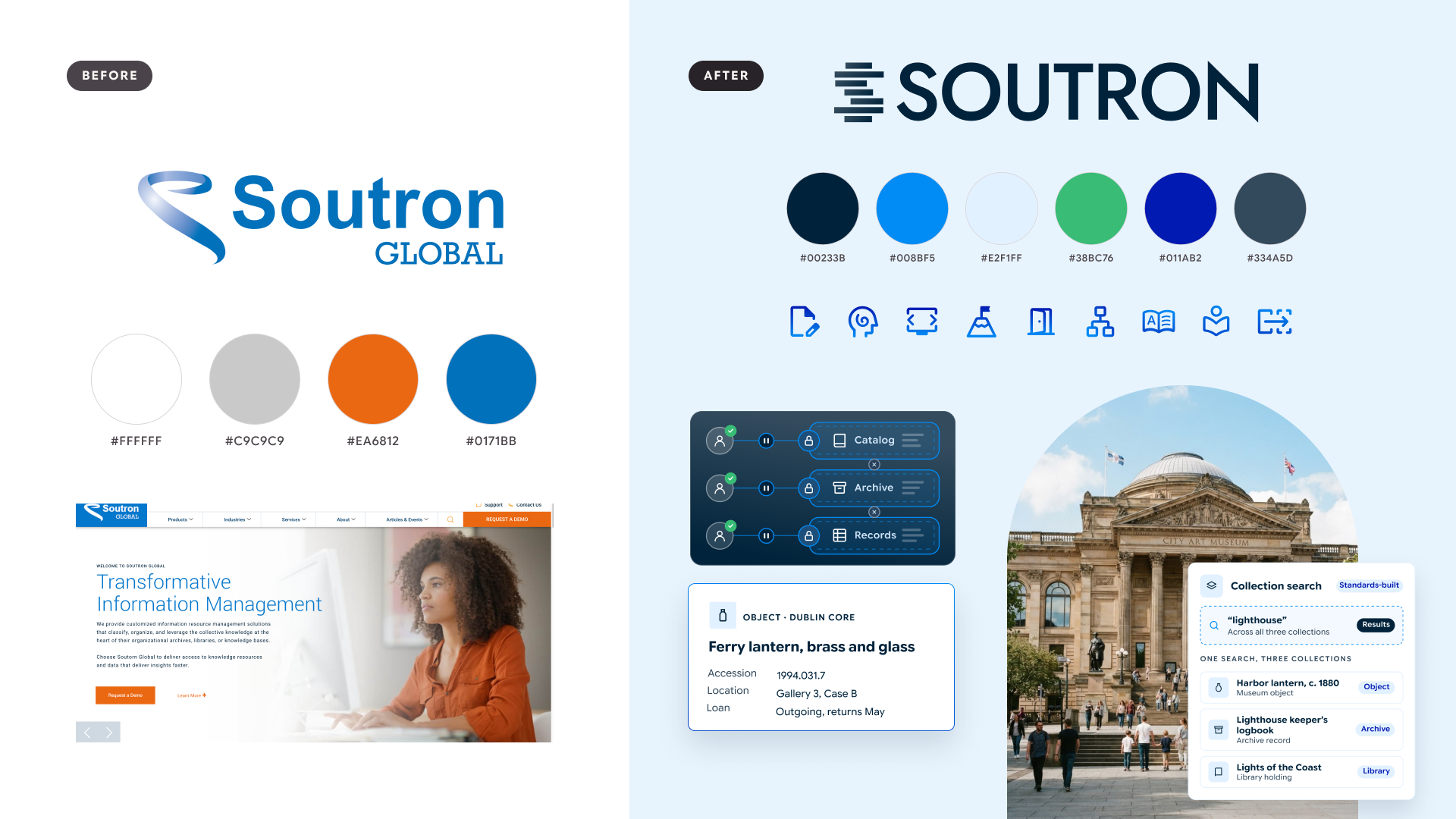
Kept the "S" as Soutron's emblem and rebuilt it from stacked, offset bars that suggest shelves and organized collections. Paired it with an all-caps geometric wordmark and dropped "Global" so the name stands on its own.
Deliverables
- Emblem, wordmark, and full lockup
- Logo usage guidelines by variant
02 · Color
Replaced the old blue and orange palette with a deep blue foundation and brighter supporting colors that feel modern and still familiar to existing customers.
Deliverables
- 6-color palette led by Deep Blue
- Color rationale
03 · Typography
Set Google Sans Flex as the brand typeface for a clean, friendly read across the website, product, and sales materials.
Deliverables
- Brand typeface and weights
- Type rationale
04 · Product illustrations
Created a simplified, on-brand illustration style to show the software clearly without cluttered screenshots.
Deliverables
- Product illustration style
- Illustrations for key products
Website design
01 · Content audit and sitemap
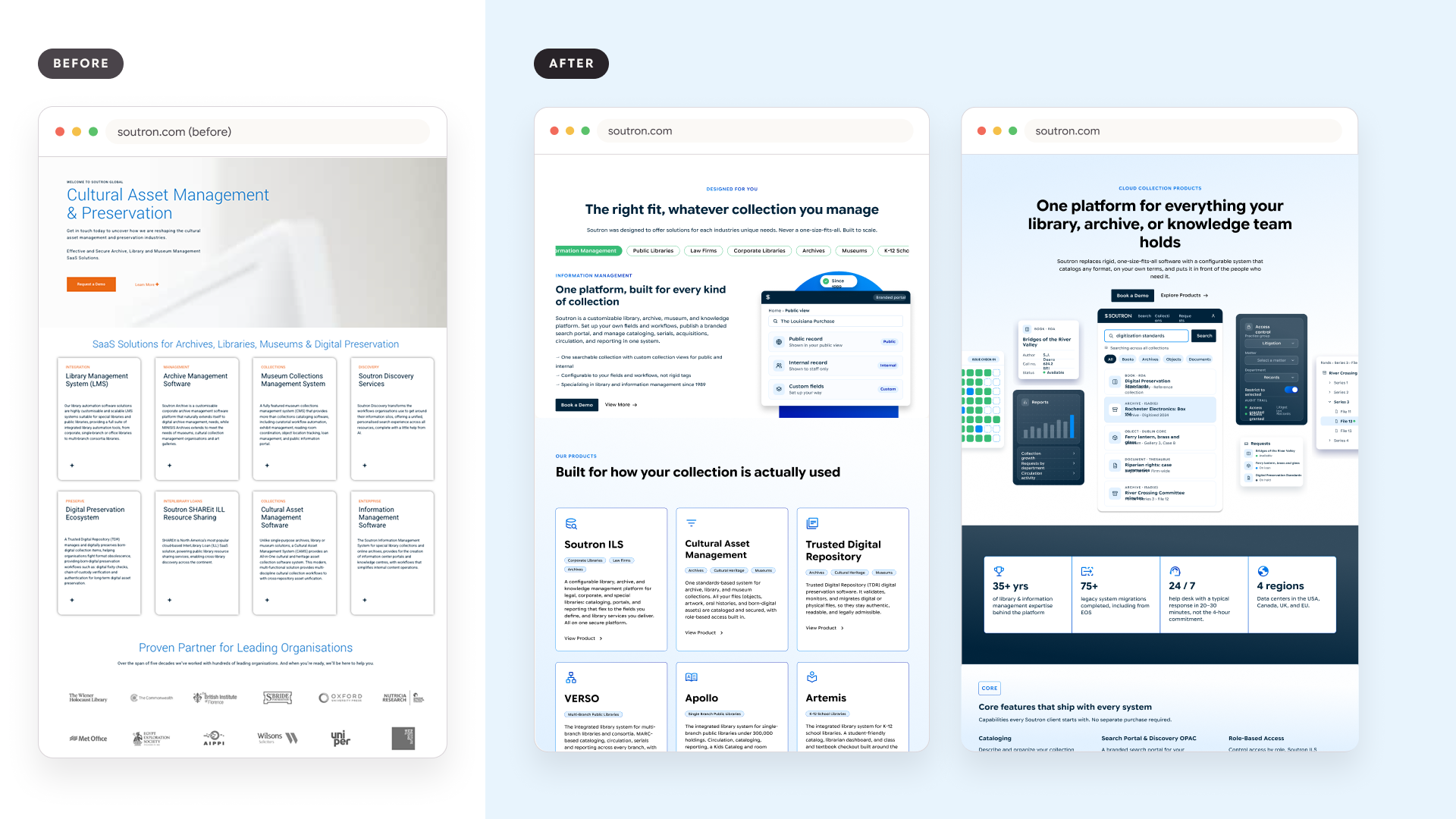
Audited all 105 URLs on the old site and flagged duplicates, including regional mirrors, old PPC landing pages, and overlapping product pages. The audit shaped a leaner sitemap for the new site.
Deliverables
- 105-URL content audit
- Keep, merge, or remove plan for every page
- New sitemap
02 · Homepage
Designed a homepage that leads with the new positioning and gives each audience a clear path to the products built for them.
Deliverables
- Homepage design
- Audience navigation paths
- Security section featuring Cyber Essentials Plus and SOC 2 Type II
03 · Product and audience pages
Designed product pages around how each tool works, and audience pages written in each sector's language, including cultural asset management for museums.
Deliverables
- Product page designs, including Soutron ILS
- Audience pages for libraries, archives, legal, museums, and corporate teams
- On-brand product illustrations in context
04 · Resources and copy
Designed a resources hub and wrote page copy to match the messaging brief, so every page sounds like one company.
Deliverables
- Resources section for fact sheets, white papers, and webinars
- Website copy aligned to the messaging brief
What changed
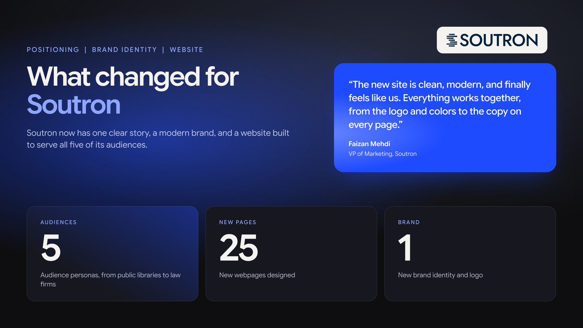
Soutron now has one clear story, a modern brand, and a website built to serve all five of its audiences.
- A 50 page positioning and messaging brief that guides every new asset created
- A new logo and full brand identity
- A full content audit of 105 URLs to clean up the site
- A 25 pages site redesign with clear paths by audience and product
- Personas for 5 audiences, from public libraries to law firms
“Before working with Kate, our brand didn’t reflect where the business was headed. The website felt outdated, the visuals were inconsistent, and it was hard to explain what we do at a glance. Kate took the time to understand our business and our customers. She refreshed our branding, tightened our messaging, and rebuilt the site from the ground up. The new site is clean, modern, and finally feels like us. Everything works together, from the logo and colors to the copy on every page. I love it. It turned out way better than I expected, and Kate went above and beyond at every step.”
Explore other projects

Ready to look like where you are heading?
Fixed-scope brand, website, and marketing sprints for founder-led companies. No retainers or hourly billing.

Brand, web, and marketing for founder-led startups, run by a senior brand lead who's built it in-house.
hello@hialoola.com