
A trusted, modern brand for a website partner built for healthcare practices
A done-for-you website partner for healthcare practices, covering design, build, SEO, and updates.
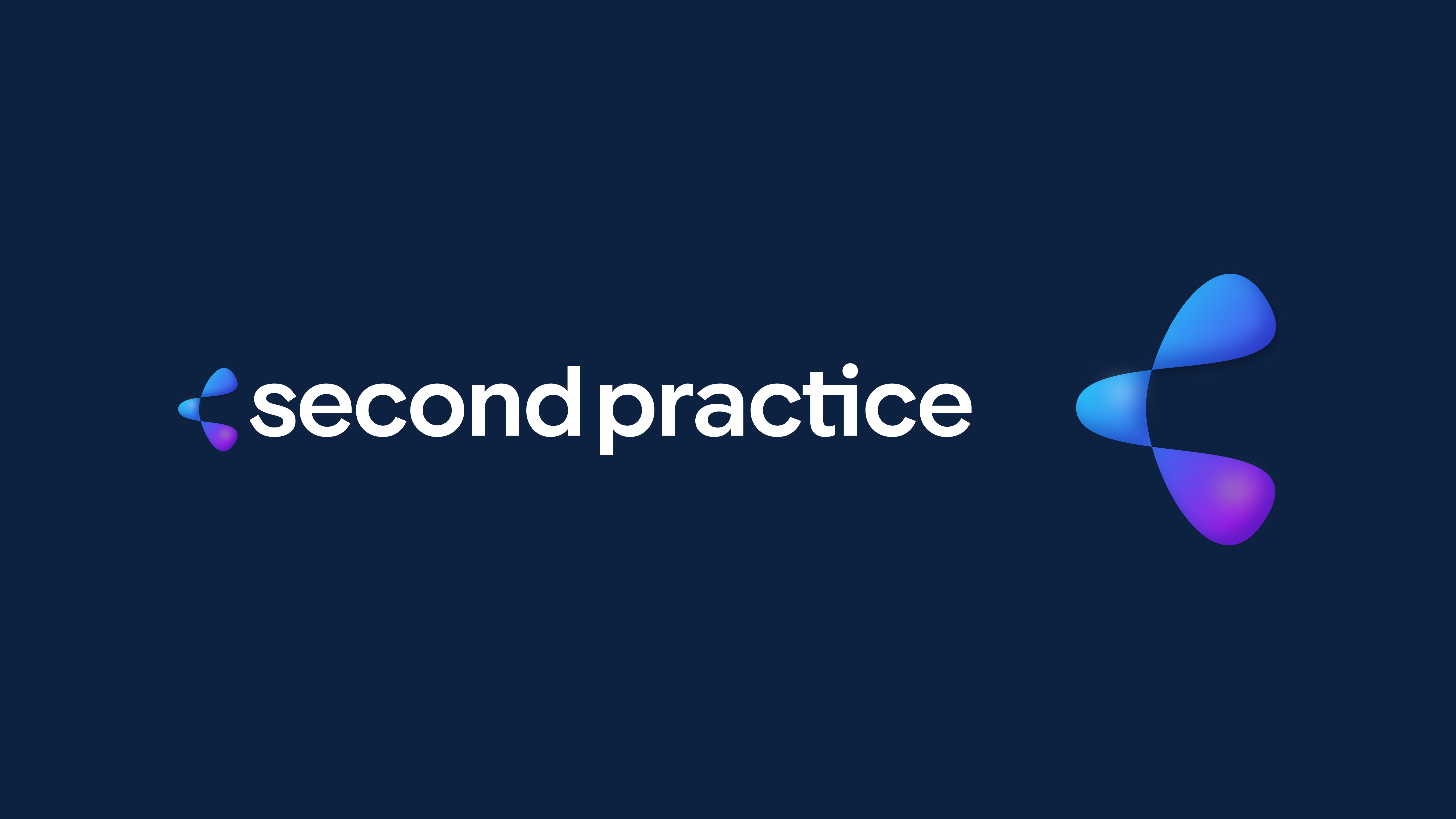
Second Practice handles every part of a practice's website, from design and build to SEO, optimization, and ongoing updates.
Practice owners are busy running their business. Second Practice takes the website off their plate completely, so it keeps working around the clock while the team focuses on care.
Second Practice needed a brand that would feel familiar and credible to healthcare audiences, while still standing out as modern, energetic, and easy to work with. It also needed a clear message that explained the full-service offer in seconds.
We started with a mood board built on soft gradients, glassy UI, and clean product layouts. That set the feel before we wrote a word. From there, we defined the messaging, built the visual identity, and packaged everything into guidelines the team can use on every channel.web
Brand strategy and messaging
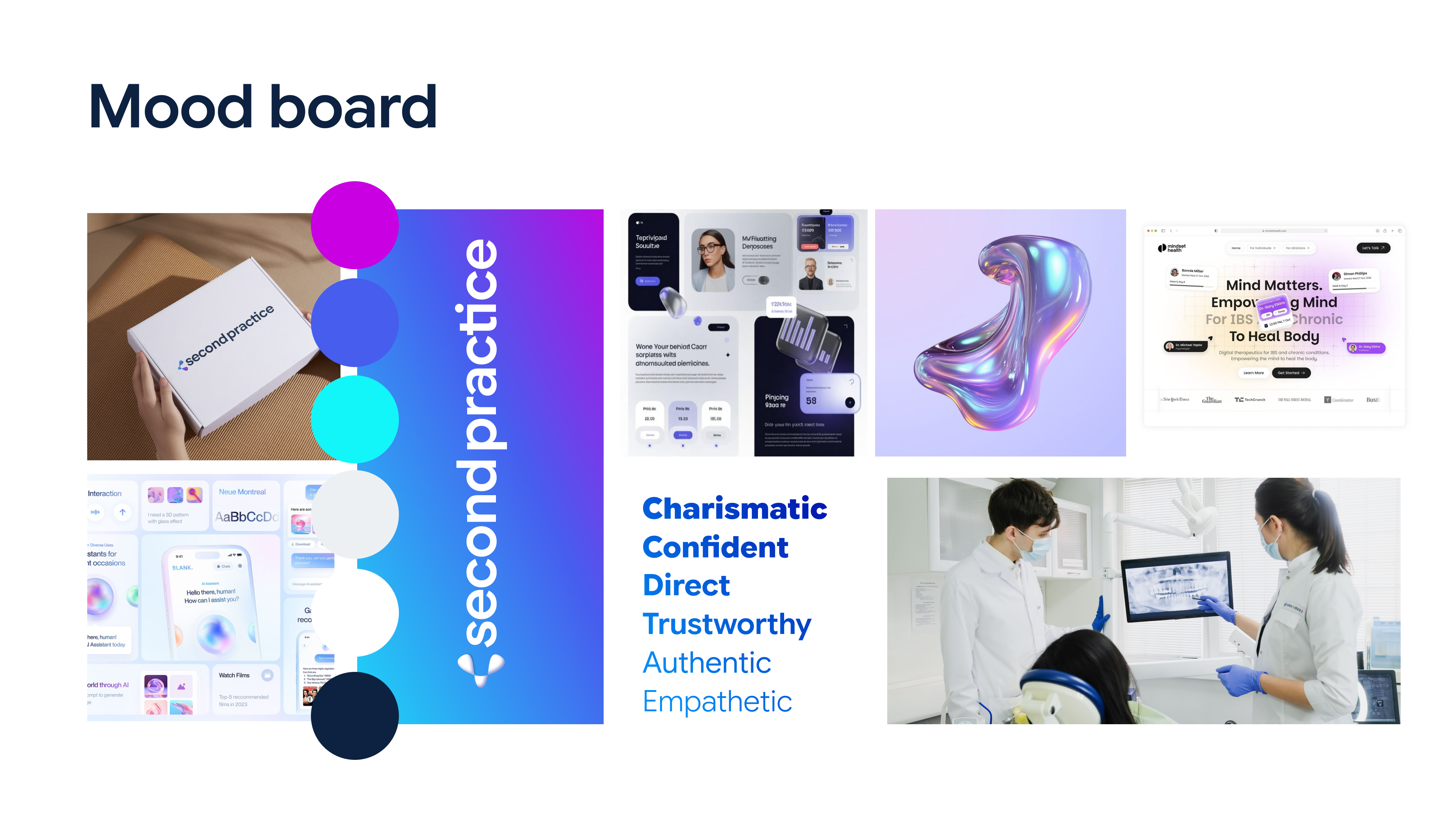
01 · Brand soul
Built a visual direction board to align on the look and feel: bright gradients, soft glass textures, and clean interfaces.
Deliverables
- Brand soul mood board
- Creative direction
02 · Messaging
Defined how Second Practice explains its offer, with a promise that puts the practice owner first.
Deliverables
- Brand promise
- Tagline: Built to convert curiosity into care.
- Motto: We build the part of your practice that never closes.
- Headline formulas
03 · Tone and voice
Set six voice traits to keep every email, page, and client call consistent.
Deliverables
- Charismatic, trustworthy, confident, authentic, direct, and empathetic voice traits
Visual identity
01 · Logo
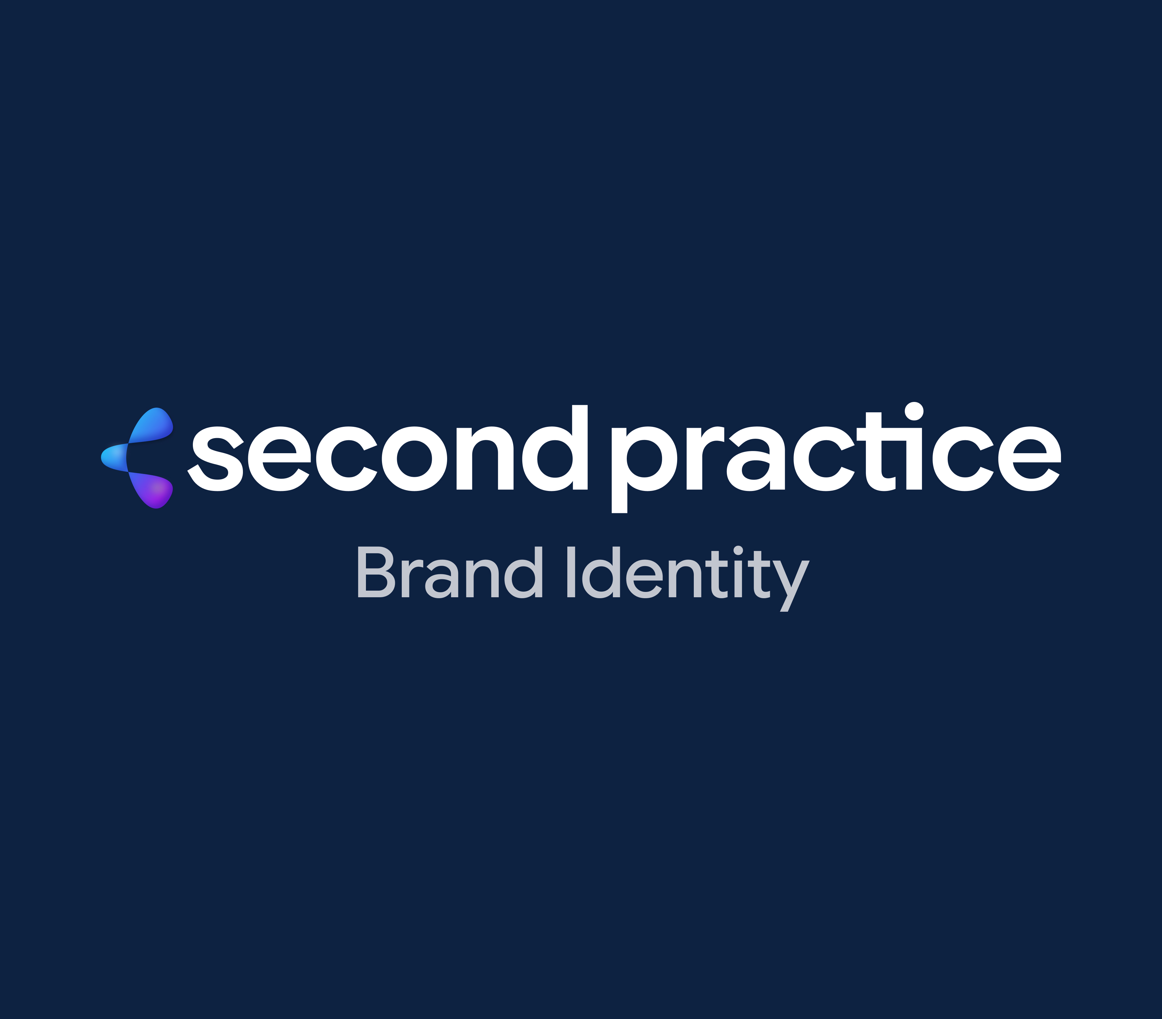
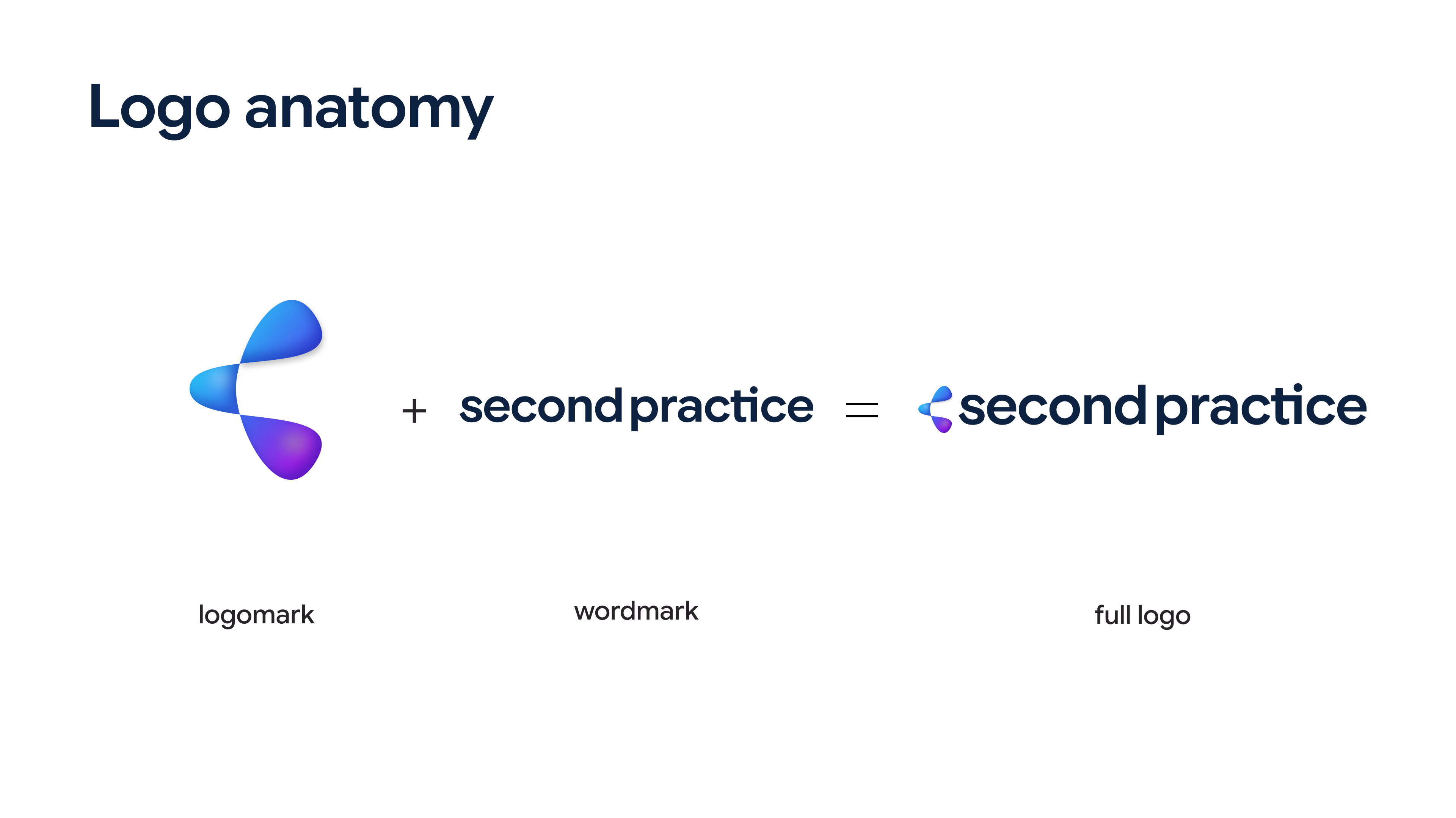
Designed a fluid, gradient logomark paired with a clean wordmark, built to scale down to a 16 px favicon.
Deliverables
- Logomark, wordmark, and full logo
- 4 logo variations
- Clear space and construction grid
02 · Color
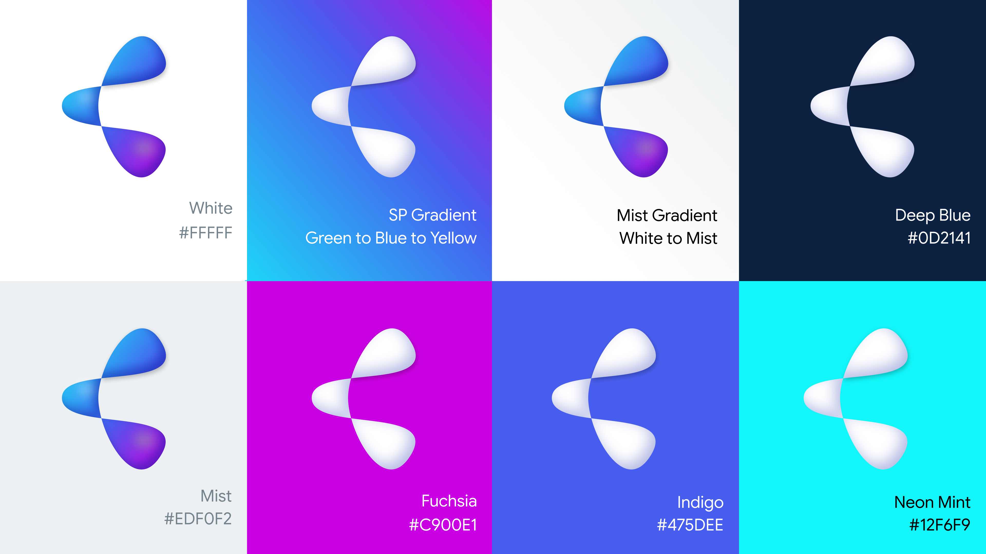
Anchored the palette in deep blue and white, colors familiar in healthcare, then added bright neons in gradients for energy.
Deliverables
- Deep Blue, White, Mist, Fuchsia, Indigo, and Neon Mint
- SP Gradient and Mist Gradient
- Logo and logomark color pairings
03 · Type and brand elements
Chose Google Sans Flex for a clean, friendly read, and created arch-shaped gradient elements to frame headshots, product images, and banners.
Deliverables
- Type scale for headers, subtitles, preheaders, and body
- 3 gradient brand elements
Brand guidelines
01 · Usage rules
Documented how to use the brand correctly so it stays consistent as the team grows.
Deliverables
- Incorrect logo usage guide
- Minimum sizes
- Square and circle favicons
02 · Co-branding and copy
Set rules for sharing space with partners and a copywriting standard for every written touchpoint.
Deliverables
- Co-branding and partnership lockups
- Copywriting guidelines (AP Style, US English, sentence case)
- A complete brand identity with 4 approved logo variations
- A messaging foundation with a brand promise, tagline, motto, and headline formulas
- Brand guidelines covering color, type, logo usage, favicons, and co-branding
"Aloola designed our brand identity and website, and both are sharp, thoughtful, and a perfect fit for our agency. They have an exceptional design eye and a rare ability to take rough ideas and shape them into a polished visual system we're proud to show clients. The website they designed brings the brand to life beautifully. It's clean, intuitive, and does a great job of showing who we are the moment someone lands on it. They were incredibly responsive, easygoing when we changed direction, and an absolute pleasure to work with. Their warmth, energy and enthusiasm made every step of the process enjoyable. We'd hire Aloola again in a heartbeat and recommend her to anyone who wants a standout brand and website."